
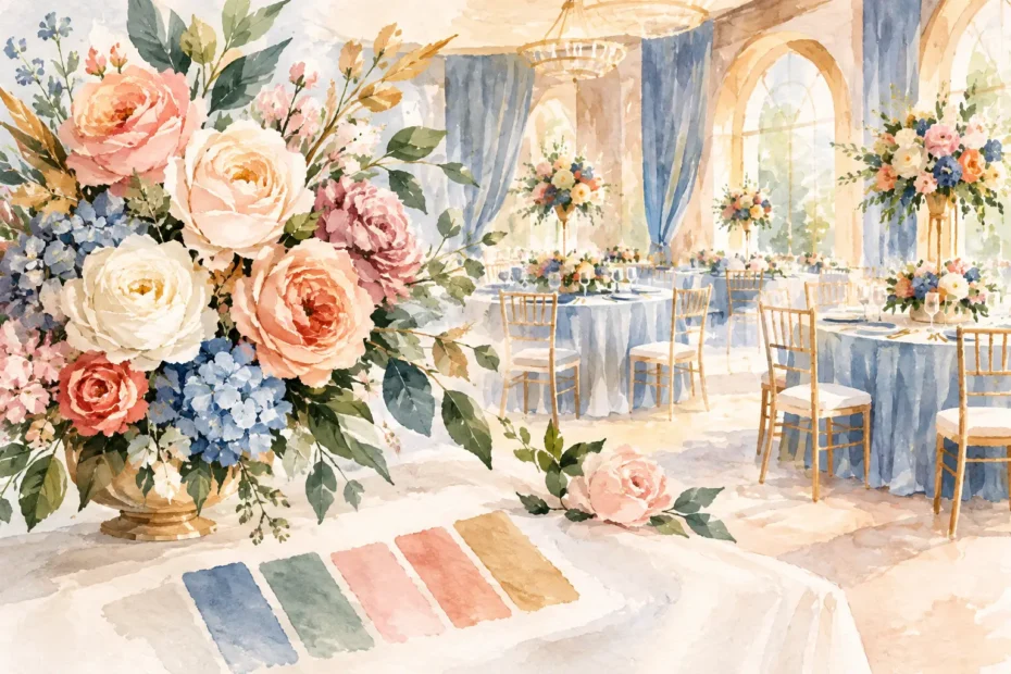
Can florals match venue colors? Absolutely. The most memorable event flowers often feel as though they belong in the room, catching the warmth of a historic ballroom, the softness of a garden-inspired venue, or the rich character of a dramatic reception space. The goal is not to make every bloom disappear into the backdrop. It is to create a beautiful conversation between your flowers, your surroundings, and the story you want guests to feel the moment they arrive.
For weddings and celebrations throughout the suburban Chicago area, venue color can be one of the biggest design influences. A champagne-and-gold ballroom, a brick loft, a deep navy banquet room, and a light-filled tent all ask something different of a floral palette. With thoughtful planning, flowers can complement those existing colors while still feeling personal, fresh, and completely your own.
Can Florals Match Venue Colors Without Looking Too Coordinated?
Yes, but matching does not have to mean exact matching. In fact, using the precise shade of the carpet, drapery, or wall paint in every bouquet and centerpiece can make a design feel flat. Floral artistry is at its loveliest when it works with tonal layers, texture, and contrast.
Think of venue colors as a starting point rather than a rule. If your reception room has dusty blue walls, for example, your flowers might include soft blue delphinium, but they could also bring in creamy ivory roses, airy white stock, silvery foliage, and a gentle touch of lavender. The result acknowledges the room without turning the tables into one large block of blue.
The same approach works beautifully in warmer spaces. A venue with terracotta brick or amber lighting may be enhanced by blush, butter yellow, peach, caramel, rust, or muted mauve flowers. Crisp white blooms can brighten those deeper surroundings, while foliage keeps the overall look rooted in nature.
A floral palette should feel intentional, not overly literal. The best designs borrow from the room and then add depth, movement, and personality.
Start With the Colors That Cannot Change
Before choosing flowers, identify the permanent elements of your venue. These are the details that will appear in photographs whether you plan around them or not: wall colors, carpeting, flooring, chairs, curtains, ceiling treatments, architectural details, and built-in lighting.
Some features are easier to soften than others. A neutral room with ivory walls and wood floors gives you nearly endless freedom. A room with patterned carpeting, burgundy drapery, or bold blue uplighting benefits from a more considered palette. That does not mean your floral vision must change completely. It simply means the design needs to account for the setting.
During a floral consultation, photographs taken in the venue are helpful, especially wide shots that show the ceremony space and reception room in their true lighting. If you have a floor plan, linen samples, invitation artwork, or images of your bridal attire, bring those along too. Each piece helps reveal where color can be echoed, where it can be softened, and where a little contrast will make the flowers stand out.
Lighting Changes Every Color
A creamy white rose can look bright and fresh in natural daylight, then turn warmer under candlelight or amber reception lighting. Pale pink can take on a peachy glow. Blue and purple flowers can appear deeper in a dim ballroom, while greenery may look almost black against a dark wall.
This is why floral design should never be decided from a paint swatch alone. Consider the time of day, window light, candles, string lights, and any colored uplighting your venue or entertainment team plans to use. If the room will shift from a sunlit ceremony to an evening reception, choose flowers that will remain beautiful through both moments.
Choose a Relationship, Not Just a Color Match
There are several lovely ways flowers can relate to venue colors. The right choice depends on the atmosphere you want to create.
A tonal approach uses shades close to the venue palette. In a sage-and-ivory space, that might mean soft green foliage, ivory garden roses, pale yellow accents, and gentle touches of muted blue. This creates a calm, cohesive feeling and is especially fitting for romantic garden weddings, showers, and intimate celebrations.
A complementary approach brings in colors that gently contrast with the room. Against deep navy walls or linens, warm peach, butter yellow, and creamy blooms feel luminous. In a brick or warm wood venue, cool blue, lilac, and white flowers can provide a lovely lift. Contrast is useful when you want centerpieces and ceremony flowers to be visually present in a larger space.
A neutral-forward approach lets texture do much of the work. Ivory, white, soft blush, and layered greenery can adapt beautifully to many venues, especially when the room itself has strong color or pattern. This is not the same as playing it safe. Garden roses, ranunculus, lisianthus, hydrangea, flowering branches, and textural foliage can give a neutral palette extraordinary dimension.
Finally, an accent-color approach uses the venue as a backdrop while saving your boldest color for a few intentional places. Perhaps your bouquets carry a hint of coral, the ceremony flowers echo it more fully, and reception centerpieces return to a softer version of the palette. This gives the celebration rhythm and keeps the eye moving through the space.
Let Your Personal Palette Lead
Your venue matters, but it should not erase your vision. If you have dreamed of soft pink peonies and the room has dark green carpeting, those flowers can still be part of the day. The design may need supporting blooms or linens that bridge the two, but personal meaning should remain at the heart of the plan.
A favorite flower, a color inspired by a family heirloom, the season of your celebration, or the feeling you want guests to carry home all deserve a place in the conversation. Flowers tell a story best when they reflect the people being celebrated, not just the building around them.
The balance often comes from deciding which element leads. If the venue is visually quiet, your florals can take center stage. If the venue has a strong existing personality, the flowers may work more like a graceful finishing touch, adding softness, romance, or a welcome pop of life.
Where to Repeat Color for a Polished Look
You do not need to repeat every floral color everywhere. A few thoughtful echoes create far more impact than matching every detail. A bouquet ribbon can reflect a subtle tone from the reception linens. Bud vases can carry a flower color found in the ceremony arrangement. Napkins, stationery, candles, or a floral rental piece can help connect the palette from one part of the event to the next.
Consider the guest experience as well. The bouquet appears in close photographs, ceremony flowers frame an emotional moment, and centerpieces live at eye level throughout dinner and conversation. These pieces can share a family resemblance without being identical. Variation makes custom floral design feel alive.
Use Rentals and Linens to Bridge the Gap
Sometimes the venue color is not the problem. It is simply competing with too many other visual elements. This is where linens, candles, vessels, arches, backdrops, and thoughtful rentals can help direct the eye.
A neutral linen can calm a boldly patterned room. Gold or black vessels can connect floral designs to existing fixtures. Candles can bring warmth to a cooler color scheme, while a ceremony backdrop can create a dedicated visual moment in a large or busy space. These additions do not have to cover every inch of the venue. They simply give your flowers a setting where they can shine.
For a celebration in Tinley Park, Frankfort, Mokena, or nearby communities, it is also worth thinking about seasonal weather and transitions. A spring garden palette may look different under a tent on a cloudy afternoon than it does in a formal ballroom after sunset. A custom floral plan accounts for the whole experience, not only the first inspiration photo.
Bring Your Florist Into the Conversation Early
The earlier your floral designer sees the venue and understands your hopes, the more naturally the final design can come together. Share what you love, but also share what makes you uncertain. Perhaps you adore a bold berry palette but worry it will clash with warm walls. Maybe you want an all-white look but wonder whether it will disappear against ivory linens. Those are design questions with creative answers.
At An English Garden Wedding & Event Florals, the process begins with listening closely to the celebration you want to create. From bouquets and ceremony moments to reception centerpieces and finishing details, each choice can be shaped around your personality and the setting you have chosen.
Your venue already has a story. Let your flowers join it with softness, color, and a little bit of surprise, creating a celebration that feels not merely coordinated, but beautifully and unmistakably yours.