
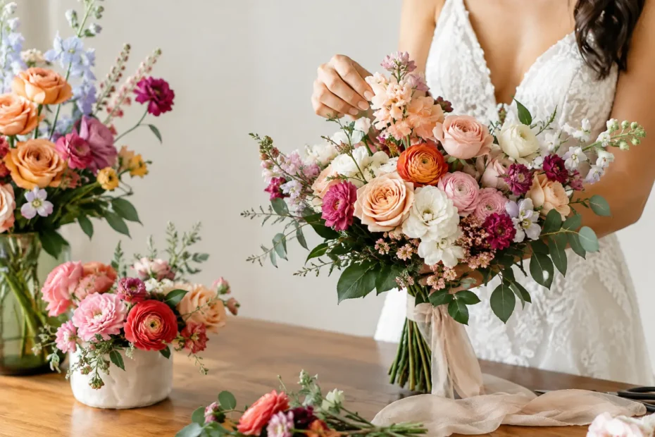
A single wedding color can be lovely. But when every bloom is the exact same blush, white, or blue, the flowers can lose the dimension that makes an arrangement feel alive. Floral color layering is the thoughtful use of related shades, tones, and accents to give wedding flowers depth, movement, and a sense of personality. It is how a bouquet becomes more than a collection of beautiful stems. It becomes part of your story.
For couples who want their celebration to feel polished without feeling overly matched, color layering offers a beautiful middle ground. It creates cohesion across bouquets, ceremony flowers, centerpieces, and personal details while leaving room for natural variation, seasonal blooms, and the little surprises that make flowers memorable.
What Floral Color Layering Really Means
Color layering starts with a core palette, then builds outward. Rather than choosing one pink, for example, a layered palette may include barely-there shell pink, ballet slipper, warm rose, mauve, and a deeper raspberry accent. The result has contrast, but it still feels connected.
The same approach works with nearly any palette. A white wedding can include ivory, cream, soft champagne, pale green, and the silvery texture of foliage. A blue palette may move from airy powder blue to French blue, slate, and inky navy. A warm autumn celebration might bring together butter yellow, apricot, terracotta, rust, and a touch of plum.
This does not mean every arrangement needs every color. In fact, that can make the design feel busy. The artistry is in deciding where each shade belongs. A bridal bouquet might hold the full range of the palette, while bridesmaid bouquets feature lighter tones and reception tables carry a slightly deeper, moodier mix. Each floral moment feels related, not repeated.
Why Layered Wedding Colors Feel More Personal
Flowers are naturally varied. Even stems from the same variety can open differently or show subtle shifts in color. Floral color layering works with that beauty instead of trying to control it away. It makes a design feel gathered, garden-inspired, and full of life.
It also gives your event more emotional range. Soft tonal layers often feel romantic and calm. Saturated shades mixed with deeper accents can feel dramatic, joyful, or fashion-forward. A palette of greens, whites, and warm neutrals can feel organic and timeless, especially when texture carries as much visual weight as color.
Most importantly, layering can reflect the way you want guests to feel when they enter the room. Perhaps you imagine a candlelit reception with rich berry flowers drifting through creamy neutrals. Or maybe you want a bright summer garden feeling, with peach, coral, yellow, and fresh green dancing together. The right palette is not simply a collection of colors you like. It is part of the atmosphere you are creating.
Begin With a Color Story, Not a Color Swatch
A paint swatch can be a helpful starting point, but flowers do not behave like flat color chips. Their petals may be translucent, streaked, ruffled, or darker at the edges. Lighting can shift them, too. A blush rose that looks nearly nude in daylight may read much warmer beneath amber reception lighting.
Instead of asking for an exact flower in an exact shade, begin with a color story. Consider whether your vision is soft and airy, warm and sunlit, refined and neutral, or bold and celebratory. Share the colors you are drawn to, along with images that show the overall feeling you love. Your floral designer can translate that direction into blooms that are available, beautiful, and appropriate for the season.
This is especially helpful when a favorite flower is unavailable or arrives in a slightly different tone than expected. When the vision is rooted in mood and layered color rather than one rigid stem, the design can stay true to you while allowing the flowers to be at their best.
Use Light, Middle, and Deep Tones
A simple way to picture a layered palette is to think in three levels. Light tones create softness and breathing room. Middle tones do much of the visual connecting. Deeper tones provide focus and keep the arrangement from appearing washed out.
In a romantic pink palette, ivory and pale blush might be the light tones, garden rose and mauve the middle tones, and burgundy or blackberry the deeper notes. The deeper color does not need to appear in every centerpiece. A few intentional touches can give the entire design more shape.
If you prefer a quieter palette, the contrast can come from undertones rather than dark colors. Cream, taupe, mushroom, pale caramel, and muted green create a layered neutral composition that feels elevated without being loud.
Let Texture Do Some of the Work
Color is only one part of the picture. A monochromatic arrangement can still feel richly layered when it combines different petal shapes and foliage textures. Smooth tulips, ruffled ranunculus, full garden roses, delicate sweet pea, and trailing greenery each catch the light differently.
Texture is particularly valuable for white and neutral weddings. Without it, all-white flowers can blend together in photographs or feel visually flat across a large reception room. Adding tonal foliage, buds, flowering branches, or textural blooms brings gentle contrast while protecting the clean, classic feeling you love.
Carry the Palette Through the Entire Celebration
Your bouquet is often the fullest expression of the floral vision, but color layering becomes most powerful when it carries through the day with intention. The ceremony is where flowers can set the emotional tone, whether that means airy meadow-inspired arrangements, grounded urns, or a floral installation that frames the two of you.
At the reception, the palette can evolve. Low centerpieces may feature a lighter, more conversational mix, while a sweetheart table can lean into richer tones or more abundant texture. Bud vases allow small shifts in color from table to table, creating a collected garden feeling. Taller designs can use foliage and negative space to keep deeper colors from feeling heavy above guests.
Personal flowers deserve the same care. Bridesmaid bouquets do not need to be miniature copies of the bridal bouquet. Giving each bouquet a slightly different balance of shades can look especially beautiful in photos, while still clearly belonging to the same celebration. Boutonnieres, corsages, and flower girl details can echo a single accent tone for a polished finish.
For celebrations in the suburban Chicago area, season and venue light deserve real consideration. A ballroom with warm lighting may welcome stronger berry, caramel, or terracotta tones. A bright summer tent or garden venue can support softer pastels and clearer, fresher colors. There is no single correct answer. The best palette depends on the setting, the season, and how you want the space to feel once it is filled with the people you love.
Where Color Layering Can Go Wrong
More colors do not automatically create more depth. A palette becomes confusing when every shade competes for attention or when the undertones clash. Cool lavender beside a strongly orange peach, for instance, may feel unexpected unless a designer intentionally bridges them with mauve, cream, or another connecting shade.
There is also a trade-off between variety and calm. If you are drawn to an elegant, timeless look, a restrained palette with tonal shifts may serve you better than a rainbow of statement flowers. If you want a lively garden-party atmosphere, more color may be exactly right, but it still needs a clear anchor.
Scale matters, too. A deep accent that feels perfect in a bouquet may overwhelm a small cocktail table arrangement. Conversely, a pale palette can disappear in a large room without enough greenery, candlelight, or structural floral elements to give it presence. This is where thoughtful planning makes a meaningful difference.
Share What You Want the Flowers to Say
The most helpful floral conversations go beyond naming colors. Talk about the memories, places, fabrics, seasons, and emotions behind your choices. Maybe your grandmother grew roses in every shade of pink. Maybe you want the reception to feel like an early September evening in the garden. Maybe you simply want guests to see the room and feel that it could belong to no one else.
At An English Garden Wedding & Event Florals, those details help guide the design from the first consultation through installation. A layered palette gives us room to create with the season, honor your style, and build floral moments that feel connected from the first look to the last dance.
Let your flowers have a little depth, a little movement, and a few beautiful surprises. The colors do not need to match perfectly to belong together. Like the people gathered to celebrate with you, their differences are often what make the whole scene feel unforgettable.