
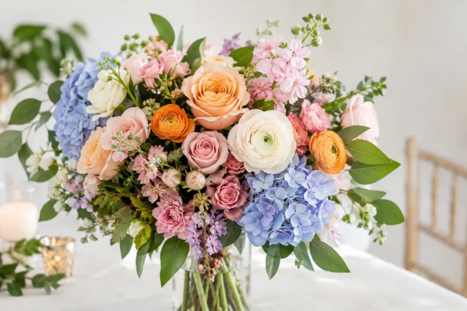
A bouquet can include every color you love and still feel beautifully composed rather than busy. The difference is intention. This guide to floral color layering shows how designers build dimension across bouquets, ceremony flowers, centerpieces, and statement installations, so your wedding palette feels like a story unfolding instead of a collection of separate shades.
Color layering is especially helpful for couples who are drawn to more than one hue but worry their florals will feel mismatched. It gives each color a role, allows the flowers to shift gently from light to dark or warm to cool, and creates movement that photographs beautifully from every angle.
What Floral Color Layering Really Means
Floral color layering is the thoughtful placement of related colors, tones, and textures to create depth. Rather than choosing one pink, for example, you might combine blush, ballet-slipper pink, muted rose, raspberry, and a whisper of burgundy. Each shade belongs to the same larger family, yet each brings a different emotional note.
The goal is not to make every arrangement look identical. A layered palette should feel connected while leaving room for variation. Your bridal bouquet may carry the richest tones, while reception centerpieces lean lighter and airier. Ceremony flowers can sit somewhere in between, drawing guests from the first moment of the day into the mood of the celebration.
Layering also keeps a palette from appearing flat. A table filled with only ivory roses can be timeless, but it may need tonal foliage, creamy ranunculus, soft taupe ribbons, or a deeper caramel accent to feel dimensional. The beauty often lives in the subtle shifts.
Start With the Feeling, Not a Flower Name
Before choosing stems, choose the feeling you want guests to carry with them. Romantic and garden-inspired can mean soft pinks and ivories, but it can also mean antique mauve, apricot, faded blue, or wine tones nestled among seasonal foliage. Modern and refined may call for monochromatic whites with sculptural greenery. Joyful and celebratory might welcome marigold, coral, peach, and bright fuchsia.
Your venue matters here. A historic ballroom, an outdoor garden, and a contemporary loft each reflect color differently. Warm wood and candlelight can make blush and champagne tones glow. A bright white room may ask for stronger contrast so the flowers do not disappear. For suburban Chicago weddings, where the season can change the light dramatically, a designer will also consider whether your flowers are being photographed outdoors, inside, or both.
Bring inspiration images to your consultation, but look beyond the exact flowers pictured. Notice whether you respond to contrast, softness, movement, saturation, or texture. That gives your florist more useful direction than trying to duplicate a single arrangement created for another couple, season, or setting.
Build Your Palette in Four Gentle Layers
A successful palette usually includes a foundation, supporting tones, transition colors, and a few expressive accents. These layers do not need to appear in equal amounts. In fact, the most memorable designs often use restraint.
Your foundation color is the visual home base. It might be ivory, blush, white, sage, dusty blue, or a warm neutral such as sand. This tone appears often enough to connect the entire floral plan, from personal flowers to reception tables.
Supporting tones add fullness around that foundation. If ivory is your base, soft peach, pale butter yellow, and creamy beige may become supporting colors. They enrich the arrangement without demanding all the attention.
Transition colors are the quiet heroes. They make two shades that might otherwise compete feel naturally related. Imagine moving from pale peach to terracotta through apricot and caramel, or from blush to burgundy through mauve and antique rose. These in-between notes create the graceful, gathered-from-the-garden feeling so many couples love.
Accent colors bring personality. A few deep plum scabiosa, chocolate cosmos, blue delphinium, or coral sweet peas can make a palette feel distinctly yours. Accents are powerful because they are used sparingly. When every color is an accent, the eye has nowhere to rest.
Choose Contrast With Care
There is no rule that says wedding flowers must be soft. High-contrast color can be extraordinary when it is balanced well. White and black, peach and blue, lavender and chartreuse, or red and blush can all feel sophisticated. The key is deciding which color leads and which one provides punctuation.
For a softer look, stay close on the color wheel and vary the value instead. Value simply means how light or dark a color is. An all-blue palette becomes much more interesting when it includes pale blue, slate, periwinkle, and deep navy. A white-and-green design gains richness through different greens, from silvery eucalyptus to deep Italian ruscus, along with creamy flowers and textural seed pods.
If you are unsure how bold to go, place the stronger contrast where it can make the most impact: in the bridal bouquet, at the ceremony, or on the head table. Let guest-table arrangements use a quieter interpretation of the same palette. This gives the room a polished rhythm without making every surface compete for attention.
Let Neutrals Create Breathing Room
Neutrals are not an absence of color. They are what allow your chosen colors to shine. Ivory, cream, soft beige, taupe, pale gray, and natural foliage can calm a lively palette or add warmth to a cool one.
This is particularly useful when attire, linens, and venue finishes already introduce color. If bridesmaid dresses are terracotta and the reception room has dark wood, adding too many additional warm shades can make the overall scene feel heavy. A generous layer of ivory and airy green may be exactly what brings balance.
Use Texture to Make Color Feel Alive
Two arrangements can use the same palette and still tell very different stories. A tightly gathered collection of roses and ranunculus feels refined and romantic. The same colors, paired with meadow-like spray roses, cosmos, sweet peas, and trailing vines, feel more relaxed and organic.
Texture changes how color reads. Velvety blooms such as roses absorb light and often make a shade appear deeper. Translucent petals, like sweet peas or butterfly ranunculus, bring softness and movement. Seeded eucalyptus, berries, grasses, and branching materials add tonal variation that prevents an arrangement from looking overly matched.
Seasonality also shapes what is possible. Spring naturally offers delicate pastels and fresh greens, while late summer and fall make room for richer dahlias, rusts, berries, and wine tones. A skilled floral designer can preserve the heart of your palette while selecting flowers that are at their most beautiful and reliable for your date.
Carry the Palette Through the Entire Celebration
Color layering works best when it is planned across the event, not applied arrangement by arrangement. Your bouquet can introduce the full palette, including its deepest accent. Boutonnieres may use just one or two colors pulled from it. Ceremony flowers can emphasize the foundation and supporting shades, framing the couple without distracting from them.
At the reception, vary the formula while keeping the palette familiar. A low centerpiece might feature creamy garden roses, pale peach ranunculus, and soft greenery. A nearby elevated design could bring in the deeper rust or mauve flowers, creating visual rhythm around the room. Candles, linens, menus, and rentals can continue the same layered feeling without requiring more blooms everywhere.
Do not forget the places guests encounter up close. Welcome flowers, escort-card displays, bar arrangements, cake flowers, and sweetheart-table designs are wonderful places for intentional color moments. These details help the event feel considered from beginning to end.
Common Color-Layering Missteps
The most common challenge is choosing colors from separate inspiration images without identifying the connection between them. A blush garden bouquet, a bright citrus centerpiece, and a moody burgundy ceremony design may each be lovely, but together they need transitional shades and a shared foundation to belong in the same wedding.
Another misstep is relying on exact color names. “Champagne,” “dusty rose,” and “sage” can mean something slightly different from one flower variety, fabric swatch, or photograph to another. Natural flowers are wonderfully variable, which is why a palette should be described by mood and range rather than one rigid paint-chip match.
Finally, remember that more flowers do not automatically create more impact. A clear palette, beautifully chosen blooms, thoughtful mechanics, and proportionate designs will always feel more luxurious than an arrangement crowded with every available shade.
Let Your Flowers Tell a Connected Story
The most beautiful layered palettes feel personal because they are built around your celebration, not a passing trend. At An English Garden Wedding & Event Florals, the design conversation begins with the colors and details that feel most like you, then turns them into flowers that move naturally from one meaningful moment to the next.
When you are choosing your palette, save the images that make you pause, notice the colors you return to, and leave room for the season to add its own lovely touch. That is where floral artistry becomes something guests remember long after the last dance.