
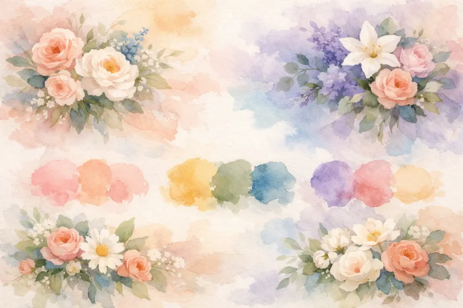
The right wedding flowers color palette does more than make your photos look beautiful. It sets the emotional tone the moment your guests arrive, whether you want the day to feel soft and romantic, fresh and modern, or richly dramatic. When your florals, linens, attire, and venue details all speak the same visual language, the celebration feels effortless and deeply personal.
How to choose a wedding flowers color palette
Most couples start with a favorite color, but flowers usually tell a fuller story when the palette begins with a mood. Think about how you want the day to feel. Quiet and elegant? Joyful and garden-inspired? Refined and formal? That emotional starting point helps guide every floral decision, from bouquet tones to reception centerpieces.
A palette also needs range. One color alone can feel flat, while too many can feel disconnected. The sweet spot is usually a primary color, a supporting shade, and one or two accents. Neutrals matter just as much here. Cream, soft taupe, fresh green, or even a deeper espresso tone can give brighter floral colors a place to rest.
This is where couples often realize that “pink” or “blue” is not actually specific enough. Blush pink reads very differently from dusty rose, and powder blue tells a different story than slate blue. In floral design, undertone changes everything. Warm colors feel sunlit and inviting. Cool tones feel crisp and polished. A thoughtful palette looks intentional because each shade belongs with the next.
Start with your venue, not just your Pinterest board
A beautiful palette on a screen can behave very differently inside a real venue. A ballroom with gold chandeliers and warm lighting tends to flatter ivories, champagne, peach, terracotta, and rich berry tones. A bright white tent or modern event space can carry cleaner contrast, like white and green, blush and black, or blue with soft neutrals.
Outdoor celebrations have their own rhythm. Garden weddings naturally blend with softer palettes and layered greens, while late summer ceremonies can support warmer, more sun-washed combinations. If your venue already has strong carpet, drapery, brick, or wood tones, your flowers should complement rather than compete.
For suburban Chicago weddings, season and light also deserve attention. Spring can support airy pastels beautifully, while fall often invites richer tones that hold their own against changing landscapes and deeper interiors. There is no rule that says you must follow the season exactly, but it helps to understand how your colors will live in the space.
Wedding flowers color palette ideas by mood
If you are still narrowing things down, it often helps to think in emotional categories rather than exact formulas.
Soft and romantic
Blush, ivory, soft peach, and muted green create a timeless garden feeling. This palette is graceful without feeling overly formal, and it works especially well for couples who want flowers to feel lush, tender, and light-filled. Roses, ranunculus, lisianthus, and delicate textural blooms sit naturally here.
The trade-off is that very soft palettes rely heavily on texture and flower variety. Without enough dimension, they can photograph as too pale. That is why subtle contrast matters, perhaps through a deeper blush center, trailing greenery, or a touch of toffee or sand.
Fresh and classic
White, ivory, and layered greens remain a favorite for a reason. This look is clean, elegant, and never tied too tightly to a trend. It can feel formal in a church setting, natural in a garden, or modern in a minimalist venue depending on the floral shapes you choose.
This palette is not plain when it is designed well. The beauty comes from movement, texture, and thoughtful floral selection. Garden roses, stock, hydrangea, smilax, and eucalyptus each add a different note. If you want a little more personality without losing the classic feel, a whisper of blush or pale blue can be enough.
Warm and joyful
Peach, coral, butter yellow, apricot, and fresh green bring energy to a celebration. These colors feel welcoming and full of life, especially for spring and summer weddings. They suit couples who want the day to feel vibrant but still refined.
The key here is balance. Too many bright notes at once can feel busy. Anchoring those shades with cream or soft foliage helps the palette breathe. This is also a lovely direction for garden-style centerpieces that feel gathered and natural rather than stiff.
Moody and dramatic
Burgundy, plum, mauve, toffee, rust, and deep green create richness and depth. This palette can feel romantic, artistic, and luxurious, especially for evening weddings or spaces with candlelight and architectural character.
Darker palettes benefit from contrast. If every bloom is equally deep, the design can start to disappear visually. Lighter accents such as blush, nude, caramel, or antique rose keep arrangements dimensional. This is one of those areas where floral expertise matters, because dramatic color is beautiful when it feels layered rather than heavy.
Modern and understated
Muted neutrals, soft taupe, beige, ivory, terracotta, and olive can create a contemporary look with warmth. Couples often choose this direction when they want florals to feel elevated and artistic rather than overly traditional.
This palette tends to rely on tone-on-tone sophistication. That means every material matters, from the ribbon on a bouquet to the candle color on the table. The result can be striking, but it does require careful editing. A single accent shade, like rust or dusty rose, often gives the arrangement a more finished feel.
Let flower availability shape the palette
One of the most practical parts of choosing your wedding flowers color palette is understanding that not every flower is available in every shade year-round. Some blooms are naturally generous in color variation, while others are more limited. That does not mean you cannot achieve your vision. It means the path may shift.
For example, if you love a very specific shade of blue, your designer may build that note through delphinium, thistle, ribbon, candles, or table details rather than forcing it into every centerpiece flower. If you want a warm terracotta look in spring, the palette may come through a mix of roses, carnations, tulips, and textural accents rather than one exact bloom.
This flexibility often leads to better design. Flowers are living materials, and they have their own personalities. The most beautiful palettes usually come from working with what is naturally strongest and most expressive, not from trying to control every stem.
Common color palette mistakes to avoid
The biggest mistake is choosing too many statement colors. If every shade demands attention, the overall look starts to feel scattered. Florals need a visual hierarchy, just like the rest of your event design.
Another common issue is separating flowers from the rest of the wedding. Your bouquet should not feel like it belongs to a different event than your bridesmaid dresses, stationery, or reception tables. That does not mean everything must match exactly. In fact, exact matching can make the design feel rigid. Coordination is better than duplication.
Couples also sometimes focus only on the ceremony and forget how the palette carries into cocktail hour and dinner. Reception florals are where color creates atmosphere. A ceremony arch may be the first impression, but centerpieces, bud vases, candles, and accent arrangements are what hold the room together for the rest of the evening.
When to keep it simple and when to go bold
If your venue has a strong visual identity, a simpler floral palette often feels more sophisticated. Historic interiors, decorative ballrooms, or spaces with bold finishes usually benefit from restraint. Flowers can then enhance the setting rather than arguing with it.
If your venue is more neutral, or your celebration style is highly personal and expressive, a bolder palette can be wonderful. This is especially true when color is part of your story, such as a favorite garden, a meaningful travel memory, or a family tradition. The goal is not to choose the quietest palette or the most daring one. It is to choose the one that feels true when everything is seen together.
At An English Garden Wedding & Event Florals, this is often where the design process becomes most exciting. Once the palette reflects not just a trend but the couple themselves, the flowers start telling a story guests can feel.
A wedding flowers color palette should feel lovely in photographs, but even more than that, it should feel like home to you – warm, expressive, and unmistakably yours.